Module 14 - Putting it all together

Added on by Victoria Moore.

Well it's crunch time here in the AAU universe and you know what that means! Last minute details, frenzied polishing and the like.

This week, my list of accomplishments was:

Refine my printed material (by trying some new color variations).
Make adjustments to my prototype and create the icon for the app
Finalize signage and environment photos
Print out initial mockups (pictures to come later)

Almost done! All that's left is the spit & polishing!

Module 13 - Restaurant Refinement and Prototype Refinement

Added on by Victoria Moore.

This week, I worked on refining and finalizing my prototype based on the user feedback that I received. My main focuses were adding user profiles (both personal and other users), refining the functionality of the tracker pages (now less glitchy), and fixing the bugs on the pages where content was showing up over the menu.

The prototype still works better when downloaded and imported into e-books (this is what I used for the user testing), however I have stilled provided a live link just in case. Thank you =)

Kurabu


Module 11

Added on by Victoria Moore.

This week I focused on getting the Kurabu website up and running. The website features links to all of Kurabu's social media accounts (Facebook, Twitter and Pinterest) as well as a home page, about, menu, theater schedule, shop, newsletter and contact form.

The link for the site on business catalyst is right here

Module 09 - Further Exploration

Added on by Victoria Moore.

This week I further explored the functionality of Indesign's prototyping tools. Of the twenty pages that will make up the full prototype, 16 are complete, 3 are partially complete and one still needs to be resolved.

Here is the link to the new prototype for demo-ing.

KURABU

Module 08 - Trying Something New

Added on by Victoria Moore.

After trying Pixate I found that I was getting frustrated with the lack of layout tools that I've gotten used to in InDesign. That in mind, I tried going back to InVision, but found that what I was trying to do wasn't really working in Invision either.

So I did some digging and found out that InDesign has some surprising features that help create mockups and prototypes in the comfort of a desktop publishing software. **cue holy music**

So after tearing apart what I'd done and spending a good portion of my week refreshing my memory of making buttons and scripts, I managed to get something a little more interactive going. Once I get all the pages done, I think it will be worth the effort =)

Here is the link to the published prototype:

Kurabu Prototype

The Gazette - Cassis PV

Module 06 - Back to Prototyping

Added on by Victoria Moore.

Here is the link to my current prototype: KURABU ONline

This week in my studies I erased my old invision prototype and decided to start fresh with my new designs. After ironing out some things with my mentor I started to realize that my ghost box idea (while great in theory) would result in a lot of unnecessary information on the user's end.

The mission this week was to pare down the user options and make the site robust, but not overly complicated. So far the login/menu/search functions are complete and over the next two weeks I'll be adding the remaining functions and refining the previous sections.

Fullmetal Alchemist: Conqueror of Shamballa

Module 05 - Making Mockups

Added on by Victoria Moore.

This week I mainly focused on restaurant materials. After reviewing the method of HOW people are going to get into the space, I realized it was inconvenient to have a traditional theater model. So instead of purchasing tickets for specific showings, people will pay a flat rate, receive a wristband (much like the paper wristlets at themeparks) and then have unlimited access to any theater they wish.

I decided on this because anime are typically only 20 minutes, so having people pay for individual showings would be time consuming to say the least.

That said, I made some changes to the restaurant materials, finally got my menu up and running and did more prototyping research this week.


Module 04 - Mapping everything out

Added on by Victoria Moore.

This week, I focused on mapping out my site so I have a rough idea of all the spreads that I'll need to do. In addition to this, I started exploring a visual language to apply across my restaurant system.

Over the summer, I had originally tried to make something plain, white and simple, but after looking at my printed ads, they're much more fun and colorful, so I've tried to apply not only that to the restaurant materials, but also an element of social engagement and interactivity.

To the napkins, I added a drawing project where people can draw their own Yonkoma (4 panel comic) and then share it to social media to get prizes. The chopsticks will feature trivia and "guess the character" games on the sleeves, and the coasters will have sections on the back to write in information to share with acquaintances.

I also started researching various ways to code my prototype and the two that I've researched are Pixate and Indigo Studio.

Module 03 - Putting it into Practice

Added on by Victoria Moore.

After all my research last week I started pulling all of what I learned into practice:

Keep in mind that buttons have to be large enough to be pressed
Text must be large enough to prevent eye strain
Watch capitalization because of licensing restrictions
Keep in mind the on-screen keyboard (not everyone has a keyboard case)

Second Draft of Kurabu Prototype

The other project for this week was finally getting all my artwork into suitable mockups. I have so far completed the restaurant portion of the mockups, including the drink coasters (as seen below).

Circular Beverage Coasters

Module 02 - Think Mobile

Added on by Victoria Moore.

Last year when designing my app, I was focused solely on the variety of features that I could offer Kurabu users:

01: Have access to series, movies, music and books
02: Make playlists and add favorites
03: Leave reviews and ratings
04: Communicate with fellow fans
05: Share news to your personal page
06: Watch anime together
07: Create fangroups and communities
08: Track what you've watched and set up queues
09: Mentor new fans / Be mentored
10: Earn rewards and collect achievements

I focused so hard on these elements that I stopped thinking about how they would appear to users and how users would actually react to them. I didn't ask the question: If I were encountering this for the first time, would I be able to complete these tasks.

While the results of my user testing were good, I found my users hesitating in certain areas, especially ones were elements weren't specifically labelled.

Knowing that, the first step for me is identifying what makes good user interface design? What elements when combined correctly will create a pleasant and easy user experience?

According to Semantic Studios, the following graphic illustrates the elements of successful user-experience design:

Click the image to be taken to the full article.

Peter Morville explains the above graphic as follows:

Here’s how I explain each facet or quality of the user experience:

◘ Useful. As practitioners, we can’t be content to paint within the lines drawn by managers. We must have the courage and creativity to ask whether our products and systems are useful, and to apply our knowledge of craft + medium to define innovative solutions that are more useful.

◘ Usable. Ease of use remains vital, and yet the interface-centered methods and perspectives of human-computer interaction do not address all dimensions of web design. In short, usability is necessary but not sufficient.

◘ Desirable. Our quest for efficiency must be tempered by an appreciation for the power and value of image, identity, brand, and other elements of emotional design.

◘ Findable. We must strive to design navigable web sites and locatable objects, so users can find what they need.

◘ Accessible. Just as our buildings have elevators and ramps, our web sites should be accessible to people with disabilities (more than 10% of the population). Today, it’s good business and the ethical thing to do. Eventually, it will become the law.

◘ Credible. Thanks to the Web Credibility Project, we’re beginning to understand the design elements that influence whether users trust and believe what we tell them.

◘ Valuable. Our sites must deliver value to our sponsors. For non-profits, the user experience must advance the mission. With for-profits, it must contribute to the bottom line and improve customer satisfaction.
— Peter Morville

So keeping these elements in mind, the next step was to identify how one gets from an idea to a final polished product. Semantic Studios has a delightful article on their development and creative process and Usability.pro also has an article worth reading, however the below graphic by Jesse James Garrett breaks the process down even further by identify which problems are solved in which phase.

Click to be taken to JJG's website.

The User Need: Many streaming service with lacking catalogs of anime.
The Objective: A streaming service with a comprehensive catalog of anime related media.
Functional Specs: See list above.
Interaction Design: How is the user going to accomplish the specified functions?
Information Design: How is the user going to understand what they're seeing?
Interface Design: How is the user going to interact with the application?
Visual Design: How can all of the above be made aesthetically pleasing?

So how does all of this pertain to a streaming service? Well lets look at a couple examples.

Directive 01: Have a database of series, music and publications available to the user. What mobile clients deliver the best experience in their fields? Hulu, Nook and Spotify are not only some of the best services in their fields, but also some of the best applications. All offer intuitive controls, are feature rich and have easily navigable interfaces.

Hulu Interface

Nook Interface

Spotify Interface

Directive 02: The ability to save and favorites your favorite shows. Looking at Hulu again, the controls are simply. Simply click the Plus Icon to add the series, and then click the settings gear and hit remove when you want to take the series off your list. However, looking at Pinterest, what if you could make your own playlists with different titles?

Hulu - Favoriting

Pinterest - Favoriting

Directive 03: Leave Reviews and Ratings. For reviews and ratings, you don't need to look any further the Amazon.com. The largest online retailer in the world, product popularity can be affected drastically by the amount of positive and/or negative reviews on Amazon.com. Design wise, Amazon improves on their desktop site by giving their tablet version a cleaner, more slimmed down feeling. Amazon mobile has all the personality of Amazon.com, but has gone to Weight Watchers and shaved off some unnecessary clutter.

Amazon.com - Review and Rating System

Directive 04: Communicate with fellow fans. There will be two types of communication available to users: Instant communication and Messaging. For instant text communication there's Line, a messaging system that works using your phone number and allows you to send stickers and chats as well as play games with your various contacts. For video/audio communication there's Skype. Skype is an old standard, however over the years it's managed to stay ahead of the curve and keep competing with other heavy hitters like Facetime. Lastly is messaging. Two great clients are gmail and Outlook, however since Outlook is feature rich and geared for business, I've opted for the simpler Gmail interface.

Line - Instant Messaging

Skype - Video and Audio Messaging

Gmail - Email/Private Messaging

Directive 05: Share news to your personal page. For sharing media, Facebook has been and remains King of the Hill. However despite this, Facebook's tablet interface comes off a bit gawky and over-sized.

Facebook - Sharing Content

Directive 06: Watch anime together. Group watching and texting might seem like an odd thing to do, however even on the internet we crave social connections. Products like Adobe Connect with it's sleek appearance variety of features would make it easy to add viewers chatrooms, creating a 24-hour, digital theater.

Adobe Connect - Group Chatting & Viewing

Directive 07: Create fangroups and communities. Again, when it comes to creating groups and communities, Facebook reigns supreme. While Twitter could be considered a close second, Facebook's versatility when it comes to making private, limited or public groups puts it ahead.

Facebook - Groups & Communities

Directive 08: Track what you've watched and set up queues. In a similar vein to favoriting series and making custom lists, with anime being as vast a category as it is, the ability to mark of series that you've completed, dropped or intend to watch would be a huge asset, and luckily there's an app for that. Anime Trakr. Not the prettiest of apps, however it does exactly what it needs to do and lets you manage your series, even down to the season.

Anime Trakr - Anime Organizer and Planner

Directive 09: Mentor new fans / Be mentored. This was hard to find an example of since there are no systems like this currently implemented in any of the other streaming services. However, after thinking about it, there are apps that use your likes and dislikes to connect with other people. You guessed it: Dating Apps. The one I chose was EHarmony which boasts an extremely detailed match finder (on that note: I've had no luck with it!) and a playful, warm design aesthetic.

eHarmony - Matching Systems

Directive 10: Earn rewards and collect achievements. Crunchyroll is the only application that has an achievement system, however this system isn't available on mobile, only on desktop. One of the most fun features of Kurabu, this system will allow members to get achievements, earn rewards, win prizes and even get their achievements mailed to them in the form of collectible button pins.

Crunchyroll - Achievements

Now that I've laid out my directives, the next step is to identify what all these sites have in common. What makes them look good, what makes them popular, what makes one more pleasant to use then the other?

Apple sheds some light on techniques and elements that they feel make for great apps in the article below:

Apple's Dos and Don'ts for great looking apps.

On a final note, what I've learned is that in no other area of design is the user experience so critical then in digital design. In digital design the user doesn't simply observe the design, they interact with it, so it has to be user friendly.

Promotional Items

Added on by Victoria Moore.

Here are some promotional items for Kurabu! These were my favorites to do! Totebags, t-shirts, wristbands, lanyards, cellphone cases and stickers.

Kurabu Printed Media

Added on by Victoria Moore.

Here are the printed advertisements for new Kurabu brand.

24x36 vertical poster. Can be given out as a promotional item or put in a lightbox.

24x36 vertical poster. Can be given out as a promotional item or put in a lightbox.

Flyers for the opening of the club.

Flyers for the opening of the club.

Postcards for the old schoolers who like to get invitations in the mail.

Postcards for the old schoolers who like to get invitations in the mail.

Kurabu New Logo

Added on by Victoria Moore.

After a lot of thought, I decided to go back to the drawing board with my logo. It was alright, but it wasn't great. I needed something new that said more about what Kurabu is then just a circle with a K. Here is the final logo (and secondary logos) that I came up with.

Week 15 Progress Report

Added on by Victoria Moore.

Finally the end of the semester is here. It wasn't easy, and in a lot of ways it wasn't fun, but regardless, I learned a lot about myself and my craft. I've grown as a person and a designer and I'm proud of the progress that I've made and ultimately the quality of what I've produced. Thank you!

I started off confident. I loved my logo and figured that with the logo and most of the identity out of the way I would be able to focus heavily on prototype and quality promotional items. It wasn't long before I realized my confidence was ill-advised. My logo needed a lot of work and for weeks my brand and my entire project suffered.

Halfway through the semester I reached a breaking point. I had gotten let go from my brand new job; I was confused, depressed and didn't know how to take any of the criticism that I was receiving. Even though the criticism was helpful, I was only seeing it as personal attacks and for a couple weeks I felt like I was at a dead-end and that nothing I did was good.

By week 12, I managed to get myself back on track and decided to start at the beginning. I sketched and I looked at my keywords and I kept in mind that my tendency is to over think and over design.

It wasn't until week 13 that I finally settled on a logo, and then it was a matter of ironing out the rest of the style guide and all the other materials that I hadn't been able to finish. It was hard, I cried and there were times I wondered if I was even cut out for this. But in the end I did it. I produced something that I'm proud of and more importantly, I'm passionate about the project again. For a couple weeks I hated and resented the project, but truthfully it was myself that I was angry at for not being able to do what I knew I was capable of.

In summation, as hard as this semester was and as many times as I felt like the situation was hopeless, I'm thankful that I had people there to tell me that I was being dumbass and that I needed to stop feeling sorry for myself and just do it. If it weren't for them, I never would have gotten everything done in time.

Click the image below to download the final presentation.

Week 06 Progress Report

Added on by Victoria Moore.

Over the last few weeks I've created a gray box prototype for the website and the streaming service, however I'd taken some time to instead focus on my brand. While not exactly ideal, I'd rather have the brand ironed out and taken care of, rather then be still struggling with it at the end of the semester. I've attached some grabs of my progress on that.


Spring Semester 2015

Added on by Victoria Moore.

Well here it goes. Another semester underway and it's time to actually do what I said I was going to do and post in this blog on a regular basis.

I wish that I was more able to do so, but I often find myself rambling with nothing of real import to say. So, that said, lets just start with something small. Like telling you all what I'm watching this week. After all, part of this project is create away for fans to share their opinions in a mature way, so why not start off with something I've recently found!

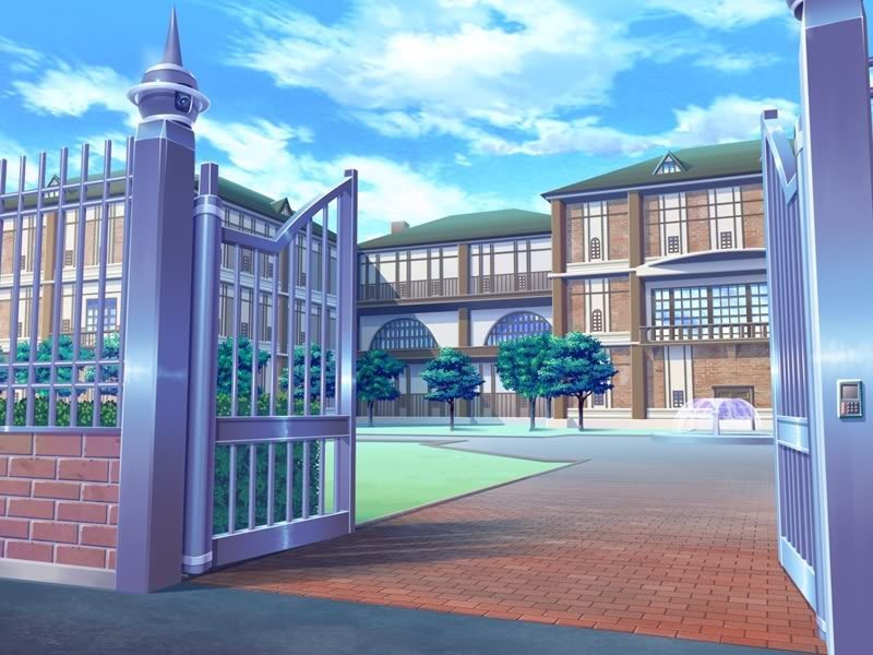
Lately, I've been watching Saint Seiya: The Lost Canvas. Some back story, Saint Seiya is originally a manga series by Masami Kurumada that was first published in 1986. Widely considered to be the template for the modern Shounen (or young boys) anime, Saint Seiya chronicles the tale of a fighter named Seiya who becomes one of 88 warriors sworn to protect the goddess Athena and the world.

Running a mammoth 114 episodes, Saint Seiya was followed by three mini series called The Hades Chronicles, a prequel (Saint Seiya: The Lost Canvas) and recently a sequel called Saint Seiya: Omega.

Saint Seiya: The Lost Canvas takes place in the 1800's and follows the interwoven fates three orphans: Tenma, a young orphan who unknowingly wields the inner power that Athena's saints call "Cosmo", Sasha, a young girl who is adopted from the orphanage as a young girl and is later revealed to be Athena herself, and Alone, a talented and pure-hearted painter who's body is captured and used to house the soul of Hades (Athena's mortal enemy).

I won't say more then that plot-wise in order to prevent any spoilers, however the 26 episode story told in two seasons is notable for it's high quality. Making a drastic jump from the mid-80's style of animation to the polished present day animation, Lost Canvas is truly a sight to behold.

Each background is lush and detailed, the character's motions are fluid, the colors bright, and characters themselves expressive.

Many first time viewers will no doubt be turned off by the cheesy dialogue and half-assed explanations of crazy powers, and of course the formula for the Shounen story holds as true in this story as it does for other stories. The villains are talkative, henchman on both sides of the equation are only present to prove how strong the enemy is and how the hero is stronger then the villain, even if it doesn't appear so at first. Every attack has it's own badly pronounced English name, and the powers range from the ostentatious to the ridiculous, but one thing holds true that will keep viewers watching, even as they're rolling their eyes:

We all respect a hero.

And that's the magic of the Shounen anime. No matter how unbelievable it may get, the core of the story is that the hero never gives up... Even in the face of the impossible, even when his (or her) body is broken beyond the point of reasonable functionality, the hero gets up one more time... This spirit is infectious, and we as humans get caught up in the excitement.

So that said, Let your cosmo burn bright young men (and women)!


Back to School

Added on by Victoria Moore.

Well as usual I have managed to break my promise  of writing every week. Unfortunately during summer vacation my mind shuts off in favor of recharging my batteries and doing leisure activities. Despite my relative silence however, I did a lot of things in preparation for the upcoming semester and launching my thesis brand.

I attended both Anime Expo in LA and Otakon in Baltimore, where I was able to connect with tons of people and get some interesting feedback on my ideas.

I attended meetings at my local anime club and continued to use their feedback as a guide to where I should focus my efforts.

And of course I watched anime, searching for trends in viewing and exploring the various ways in which to the anime watching experience could be improved.

So what are the goals?

Well in the coming semester I'll be working on brand finalization and the development of the digital components (such as the website, streaming service)

My secondary goal is to actually post every week... That should be much easier now that I'm back in school... I'll actually have a schedule instead of going from one place to another!

Anyway, thanks much!


Apologies

Added on by Victoria Moore.

It's amazing how fast time flies by when you're busy... In addition to preparing for Anime Expo (the largest Anime convention in the US), I have also been attempting to get a car!!!

But enough of the excuses. I promise to post every week and I've pretty much ignored you all for that last month which isn't cool...

So as an apology, here's a fun little website that I stumbled across recently!

Nerds and Nomsense is a geek culture website that appeals to retro-chic tendencies that most nerds have... A sketched out logo with a nod to the horn-rimmed glass that were once a symbol of nerds everywhere, the website features everything from articles on nerdy topics to DIY crafts and delightfully nerdy food and drink recipes...

Click here to visit Nerds and Nomsense!

Click here to visit Nerds and Nomsense!